
Keep the feedback coming guys! We really appreciate it!
1 Like
Why the colors are the black, white & orange only? Green is good for eyes.
1&6 probably would grab your eye the most. Yes they look similar in style to some other games but they use that style for a reason. I think they let you know the time period and roughly the type of game. I personally would like to see the side shot of 2 in stance to duel with a similar style.
Yeah i like this as well. I don’t think adding the upper half in 2 helped in anyway.
1 Like
Actually all of them are IMHO no so good and some of them if they were real game covers would force me and some of my firends NOT to buy this game at all, if we didn’t knew about the game in the first place.
1: This is IMHO the worst. Not because of the pose or anything but because of the sword. The sword seems to be a scottish claymore, the hilt seems to be late 15th and early 16th century according to my knowledge. If someone could prove me wrong with a source I would be very grateful though. Nevertheless, another point that makes this picture bad in my eyes is the missing scabbard. As with this segment you could see a scabbard if Henry would have worn one (and it seems that scabbards will be in the game according to the last video update) so it should be also on the cover.
2: This cover simply does not appeal to me if I didn’t knew the game it would look like a story between the three people in the cover.
3: Too much ornamentation albeit the quiver on the horses looks nice . The ornamention gives a fantasy feeling.
4: Nice picutre the logo is too dominant in the middle, if it would be not too dominant then this would be my 2nd choice. Also more scabbards on the soldiers would be nice 
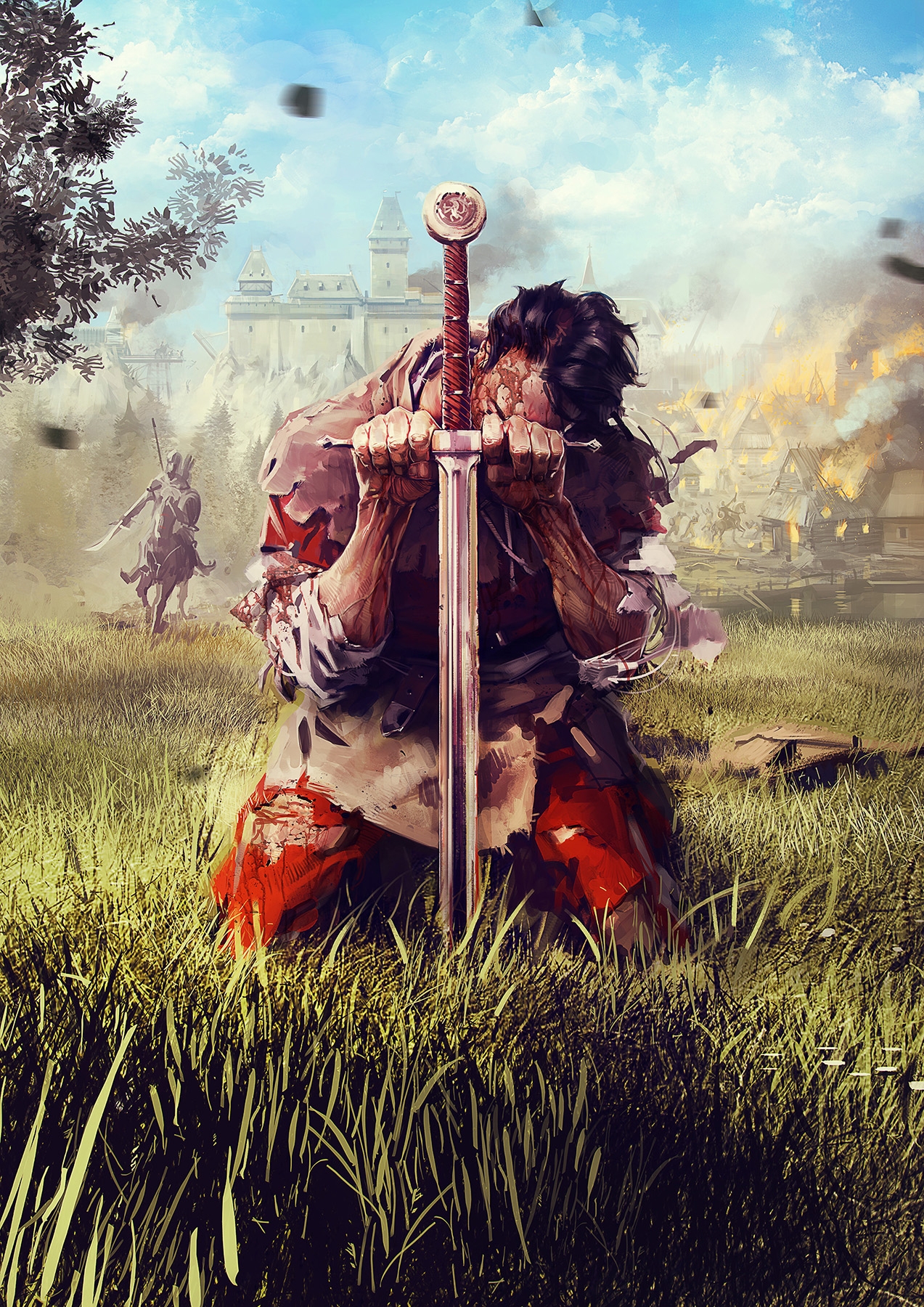
5: Would the kneeling henry not stand out but would be included in the contemporary painting then this cover would be perfect. The cover should be comprised of only and only a contemporary medieval painting, and henry could be knneling there. The game title could be also incorporated in the painting. This would let the game stand out the most!"
6: Is too minimalistic in my eyes and reseembles the trend of most never game covers. But this is not the mainstream game so it should not have a mainstream cover!
Will you make a Big-Box for the PC Version? I hope then please use Cover 5 for the Big-Box and a different cover for the DVD/BluRay cases/case.
I hope you will make a colored paper manual with contemporary color illustrations. This would be really nice and to be honest You could make the manual codex like, so that the button usage would be illustrated in contemporary art 
The most important thing!
Never picture something in the cover that is not in the game (This applies especially for armor, weapons and accoutrements including scabbard! Or suggested game mechanics
Voted for the artistic/periodic arrangement option. While I do not really like the example presented, I think a medieval art style cover would (a) truly stand out in the shelf and (b) underline the aspect of the game being historically accurate.
As for the image itself, I guess anything in the style of a medieval tapestry would be totally cool. The motif could even be Cuman, Henry and Woman, which otherwise would be my second choice of the lot
1 Like
This topic is now a banner. It will appear at the top of every page until it is dismissed by the user.
1 Like
This topic is no longer a banner. It will no longer appear at the top of every page.
that is just beautiful! golden one is da best tho!
- kinda remind me medieval 2 total war but its good maybe with some background
- really nice but…
- this one is really good! I think its best for game
- I think second best but letters are over riders head which is little bit wierd
- I saw this one a lot so meh
- nothing to this one really
so the best is number 3 then 4, 2, 1, 5, 6
3rd is really stand out for me, its unusual from all videogame covers in general. I’d be interested in something like that.
I like 6. It seems truest to the setting of the game.
1, 4, 5 and 6 looks great. Would love to have all of them in my room.
If I have to select from pictures, I would vote number 5.
But this one I like more than any of those:
And also the original artwork here is so good, would immediately catch my eye:
14 Likes
IMO that artwork with Henry on a horse with KCD sign above him that so many people like would be a great poster, but a terrible game cover. The horse rider is too small, it’s too dark and thus unrecognizable, there is a whole lot of nothing and unreasonably big KCD sign. All in all, hardly something that would bring attention to a a small game box among hundreds of other games.
1 Like
Agreed. That pic is awesome. No need to change it.
I voted for 1, but what is that thing in the bottom left? Also the thing on his right shoulder? It looks like it has been hastily cropped. It needs a better background. Maybe smoke or something.
1 Like
I’ve chosen 2nd one. It gives me the best feeling there is a story I will “write” during game.
I like Number 5 the most. It tell a story of a knight on his last legs, trying to get up by using his sword as support.
I believe no.1 is simple, has great impact, and gives an immediate idea of what the game is about. Fighting in full armor.
Apparently the more people vote, the more even it is.  I guess this poll won’t be very helpful, with all the artworks having similar amount of support.
1 Like
I chose 3. because it is most interesting to me. Background motive creates nice border, its colorful so it drags ones eyes and other characters are filling enough, to not make the picture too empty (like 6., certainly 6 is the weakest pic for me). Also amount of detail is really cool.
Second choice would be 1. for me. Its simply, but not empty. Cold as a steel However I wouldn’t care, if I wouldnt know what is KCD, I’d just skip because I saw similar on other games that I played or simply even didnt care to buy and play. Dunno why, but at first it reminded me TW Medieval 2, however that is more colorful, still composition is kinda similar.
Third place would be 4. White place in the upper side gives more room for banners, that evokes medieval battles and chores. Just looks good, still 1. seems more badass to me.
Fourth place is 2. Its too colorful and background seems to be there only to fill white space and by its color it drags my eyes from important stuff to background. Background should be less visible imo.
Fifth is 5 ( ) I have nothing to say about it. Just nothing interesting for me.
- Well, as I said.Too empty. Kneeling guy, with a sword and something (is it a crossguard? Too sharp angle imo…) Tries to be similar to 1. but in a humble manner. Idea and feeling of picture might be cool, but in the end, I dont see it good enough to make me learn something about the game.
edit
ah ok, so im not the only one who thought this 