Wow! image one with a clear lead, yet it seems so dull???
I voted #2 but also like #6 … however the images bax_cz posted of the already presented ‘placeholders’ beat them all… IMHO 

Wow! image one with a clear lead, yet it seems so dull???
I voted #2 but also like #6 … however the images bax_cz posted of the already presented ‘placeholders’ beat them all… IMHO 
I vote for #6. This game is about the personal story of Henry, who is simply trying to find his own way during difficult times over which he has little influence.
I consider #6 is the image that catches this feeling best without being over dramatic like #1 and #5. It is personal enough and close to a contemplating (reflecting) Henry facing his destiny.
My two cents.
Serk
This one is just perfect. Thumbs Up! Dan Vávra has to see this!
i second number 6 for all the same reasons tsunamik listed
misclicked and voted for 1 
really like number 1 and 3.
1 and six felt a little too bland for my vote. They feel too similar to a military shooter cover; solitary make with weapon. The rest tell more of a story and give me a glimpse into what that story might be like. 4’s focal point is somewhat unclear; strained between the two halves. 3 feels like it’s channeling final fantasy title art which is OK but didn’t do it for me. Between 2 and 5 I chose 2 because it seems to tease a broad story, the heads in the top half grab your attention before you notice the little hero holding the banner for his cause below. It reminds me of an Indiana Jones poster or dvd cover in a good way.
Pomohl vám tento průzkum k určení obalu hry, či k inspiraci od komunity, nebo už máme udělaný daleko jiný 
1 and 6 are the best! I really like the dirty gray colors against a white background
It’s still number One for me, obviously (nothing changed).
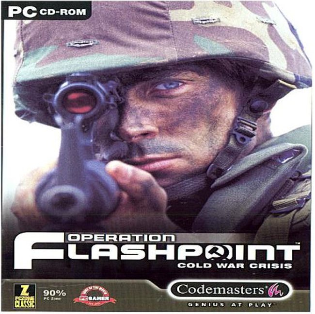
To sell a product, you need to see a face. A soldier’s face. It worked well before already…

Hmm… that was a good game 
To sell a game you specifically have to sell a soldier’s face?=/
Hello,
I see a Sallet helmet on cover #2 and cover #5.
Sallets did not excist in 1403.
Man it’s probably just a visored bascinet or Barbute. Slightly stylized for artistic purposes no doubt.
Don’t forget that Sallet’s originate as variances of the bascinet, eventually going on to develop into the tailed predominately German form that the name is synonymous with.
Oh yes, please this one. I like this one the most by far.
perfect. PLease include this one in the voting!
Exactly. We need this as a choice! (Please  )
)
I just have to say, this one looks absolutely fantastic. I think if it was in the polls it would win by far.
I like number five the best. First off, I would pick it up off the shelf. All the others look similar to other covers I’ve seen on the shelf with the exception of number 4. Also, the color most definitely catches your eye. Overall, I really like number 5 because it shows Henry and his sword in that emotional kind of way indicating an intriguing story. Then I love the back as it also shows the story line (although, you wouldn’t recognize this if you haven’t read the story line or possibly the introduction on the back of the case.) The back also has that medieval manuscript type of art hinting things from the game. it also is simply beautiful art. finally the back round does show that there will be battles, war, and medieval combat in the game. Sorry for a long and late (very late) response.
It is true that the sallet originate from the bascinet, but the #6 is most certainly a later version of the sallet, mid 15th century. both sallets and barbutes were “created” in 1407 , thats the first recording.
I’d have to agree with you there man. Even though we can’t see the tail, the helmet in number 6 can almost only be a mid 15th century sallet… probably why that particular art work wasn’t chosen 