
1 - Bad idea - looks like Assasin Creed IP
2 - Not bad at all (my second favorite)
3 - bad merging backgroud with foreground, have not border, strange flow of objects
4 - My favorite, perfect for me - medieval theme, war, there is all neccessary things
5 - Old famous theme, but for novice says nothing. A bit depressive for newbie
6 - Not bad, but not so easy to recognize
I Voted for 6 (Henry’s Head in Profile). It is clean and fresh, different from other covers for medieval/fantasy games which tend to be more complex.
I like it because it will stand out. It is clear it is about a knight, rather than a strategy game (they generally will show a battle or several characters together). Also I can tell that the armour is accurate because I like armour. The accuracy speaks to me of the possible quality of the game.
The simplicity shows confidence in what you have made.
My second Pick is #1 though it is less clean.
2, 3 and 4 all look like strategy game covers to me and the genre has plenty of those around.
5 I dislike for two reasons, one it makes the game appear to be primarily about religion (It is in part to be a faithful to the medieval setting), two the character appears to be surrendering which is something I wouldn’t be after in a game. It is my least favorite.
This is why I think #6 is the best choice.
I would suggest doing some versions of #6 with different emotions. The contemplation of this one is nice but I wonder what one with a battle cry would look like? That emotion might help sell that the game has action.
1 Like
No. 1 is incredibly generic
I voted for no. 5 as I like the emphasis on the sword while still allowing you to make story relevant background.
I also like the style of no. 3 just that the Henry and Cuman looks a bit off. I would meaby put a Henry from cover no. 4 there instead.
Actually having looked above I agree that #1 is too similar to other game covers such a Medieval II Total War. Last thing you want it to have people think it is a strategy game. I’d stick with a single character to push that it is an RPG/ACTION game.
I wouldn’t worry so much about 100% accurately representing the game on the cover, that’s what the back cover description and images are for. #1 thing is to get every RPG/Action game fan to pick it up. Then they can buy it on it’s merits. While It’s not intended to be mainstream that doesn’t mean it can’t make it big by tapping into something people didn’t know they wanted. After all there haven’t been many realistic Medieval RPG games
1 Like
That’s the best variant I’ve seen of that cover.
I picked 6, because of all those pictures, it sure is the most special one. Others look generic and/or boring, while this one is the best one from an artistic look on it, in my opinion. It says a lot about the game too. The game is not like the others, it’s actually one of a kind, the only one in it’s special genre and Cover 6 is the only one to support that fact.
1 Like
No2: I love the colouring
No5: The broken Henry is characteristic for the game
Z návrhů se mi celkem líbí 5., podle mě hře nejvíc sedne, ale barevnou paletu bych si představovala spíš z návrhu číslo 4. V návrzích bych ubrala na barevnosti, nějak mi příliš barev nesedí k tématu hry stejně jako všechny ty návrhy s rytířem (hlavní postava není rytíř a příběh hry nemá být o tom kterak se kovářův synek rytířem stal).
Úplně nejvíc by se mi líbilo propojení obou návrhů v příspěvku Paula, místo Henryho na koni tam dát Henryho v kleče se opírajícího o meč a ponechat ponurou barevnou paletu návrhu s koněm. Tohle by, podle mého názoru, sedlo ke hře nejvíc.


4 Likes
First of all, covers are all amazing. I’ve chosen number two, because I love the “Man on a horse and a village on fire” idea. It would be awesome, if there would be just this man on a horse in front of that village and in the upper part would be Kneeing Henry with Sword instead of these three characters. It looks brilliant in my mind!

2 Likes
Cover number 6 lacks any personality. Knight potrayed there could easily be a Henry from medieval England/France/german parts of Holy Roman Empire… It is as unimpressive as cover number 1… Covers 2.- 4. are the embodiment of adventure while cover number 5 clearly tells everyone this is CZECH Henry the Hero!
1 Like
a co dát sanci komunite neco vytvorit? ja sam to neumím, ale myslím, ze nekdo by neco vytvorit dokazal
As an art student I voted for 5. 5 and 6 are OK. I mean not the best but bearable. All others are like “I saw that million times before” and they just seem like a bad digital sketch imho. Why don’t you go with something period appropriate? Like a woodcut? It is an old technique but you can do whatever you want with it. A lot of contemporary artists still use it. I would be delighted to see something different on a game box art than some boosted ussual 3d render or photoshop thing.
3 Likes
Out of these 6 artworks I prefer number 5 for the game cover. Perhaps it would be better with even lighter shades of yellow for the background, making Henry stand out more against it and the details of the background not that noticeable upon first look.
However, same as some others I like this artwork even more for the game cover:
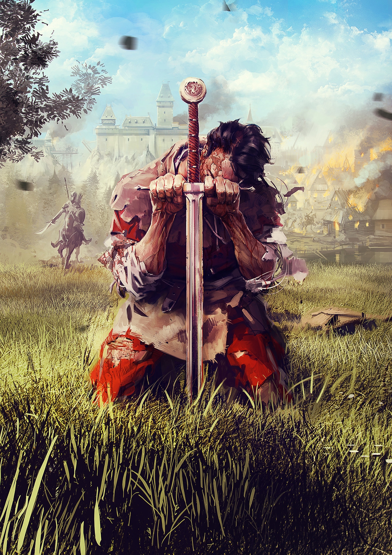
I both cases the artwork both catches the eye and suggests the game will evolve around the story of the main character thrown into turmoil of historical events.
Out of the given 6 the second best is imo number 4, attracting attention well, although somewhat reminiscent of Dragon Age and somewhat suggesting strategy rather than RPG.
I like number 3 too, almost fantasy feel to it like early works of Vallejo but the color palette is perhaps too restricted which makes it a bit dull and possibly easy to miss among other covers.
I find numbers 6 and 1 the least attractive and at least for me misleading - I would expect something along the line of Chivalry or For Honor rather than an RPG.
4 Likes
No its not, remember were looking for a cover not for a nice picture.
This one has this huge logo as an eye catcher which says absolutely nothing to the random dude scanning the covers in the story. And those that take a clearer look at it will just see some dude on a horse with a flag. You need to literally analyze the picture for a few seconds to even notice the sword the castle and that those black particels are clouds coming from that fire represented by some orange/red color.
TL;DR: Thats a beautiful painting or artwork but its useless as a cover for the box.
Voted for 4. Colors are great. However, 6 is also great, because it is quite unusual.
1 Like
Voted for 1 , because the graphics are realistic not like artwork, if you understand me. I would love to see cover with Henry on his knees like in picture 5, but with armor and different background (maybe battle field or just nature, castle…)
všechno se mi nelíbí, je to přiliš laciné a tuctové snad jen 4.a 6 jsou o trochu lepší.
Mně se líbí spíše jasně daný jednoduchý styl a spíš symboly a lehké naznačení hry jako měla mafia
1.nelíbí se mi, vypadá jak zaklínač a je to velice tuctové, chlapa ve zbroji má mnoho her a filmů, navíc to brnění vypadá jak kdyby jste byli super hrdina co zachrání svět
2.koník je moc malý a celkově spodek neladí s vrškem
3.evokuje ve mně fantasy ala oblivion nebo baldurs gate a ne středověk
4.pro mně vítěz jen ta červena je divná a jezdcovi chybí hlava, celý spodek bych dal barevnej
5.problém je, že ten žlutý ornament působí příliš jako nějaká muslimská hra alá prince of persia
6.tento jednoduchý směr je dobrý, ale něco tomu chybí
Voted for 6. Minimalistic, catches your eye on the first sight. Resembles a bit Dark Souls to me, though.
1 Like
2 and 4 are nice but look unfinished. i think the kneeling/mourning hero on the cover is the best way to go as it raises questions and fits the game. That said a kneeling henry with a bit different background would be the best
1 Like